I remember obsessing over the “in-between” details on this one — the kind nobody points at directly (grid, spacing, pattern rhythm), but everyone feels when the brand finally looks like it belongs on a tag, a poster, and a hoodie at the same time.
Context
UNSEEN is a streetwear label built for people who don’t want mainstream approval — premium urban pieces with an underground tone. The brand needed a visual identity that could live across garments, labels, packaging, and social content without losing that outcast energy.
Overview
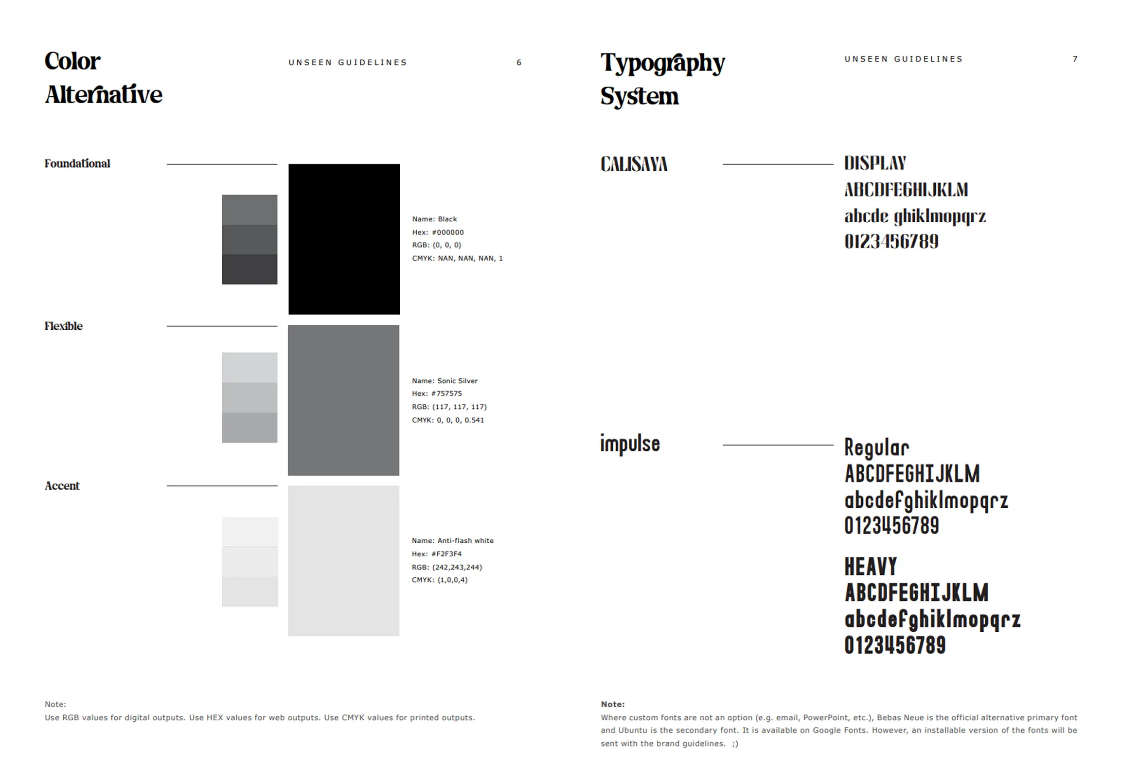
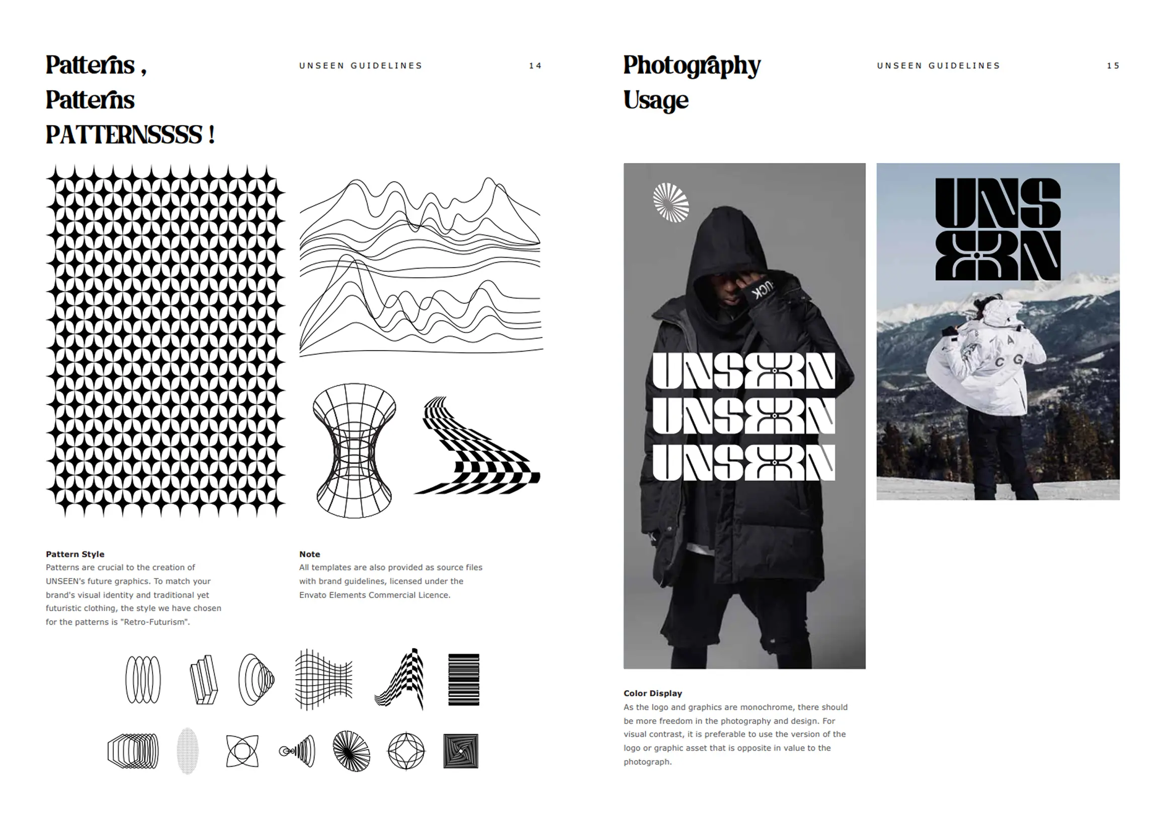
I created a retro-futuristic, monochrome brand identity and delivered a complete brand book covering logo system, typography, iconography, patterns, layout rules, and usage guidelines — built to be consistent, scalable, and production-ready.
Challenge
The core challenge was balancing two things that fight each other: a look that feels genuinely “outside the system,” while still being readable, coherent, and usable across real-world touchpoints (prints, embroidery, hangtags, web, and social). The identity needed to feel underground without looking unfinished or random.
I developed a tight visual system rooted in a monochrome palette, retro-futuristic cues, and repeatable graphic assets (icons + patterns) so the brand could be instantly recognizable without relying on color. The brand book standardized every element so the identity remains consistent whether it’s on fabric, a lookbook, or a digital drop announcement. Which led to: